
 小小
小小 swiper视图容器
如遇下载蓝奏网盘打不开lanzous替换成lanzoux尝试!
基础库 1.0.0 开始支持,低版本需做兼容处理。
滑块视图容器。其中只可放置swiper-item组件,否则会导致未定义的行为。
属性 类型 默认值 必填 说明 最低版本
indicator-dots boolean false 否 是否显示面板指示点 1.0.0
indicator-color color rgba(0, 0, 0, .3) 否 指示点颜色 1.1.0
indicator-active-color color #000000 否 当前选中的指示点颜色 1.1.0
autoplay boolean false 否 是否自动切换 1.0.0
current number 0 否 当前所在滑块的 index 1.0.0
interval number 5000 否 自动切换时间间隔 1.0.0
duration number 500 否 滑动动画时长 1.0.0
circular boolean false 否 是否采用衔接滑动 1.0.0
vertical boolean false 否 滑动方向是否为纵向 1.0.0
previous-margin string “0px” 否 前边距,可用于露出前一项的一小部分,接受 px 和 rpx 值 1.9.0
next-margin string “0px” 否 后边距,可用于露出后一项的一小部分,接受 px 和 rpx 值 1.9.0
snap-to-edge boolean false 否 当 swiper-item 的个数大于等于 2,关闭 circular 并且开启 previous-margin 或 next-margin 的时候,可以指定这个边距是否应用到领先个、最后一个元素 2.12.1
display-multiple-items number 1 否 同时显示的滑块数量 1.9.0
easing-function string “default” 否 指定 swiper 切换缓动动画类型 2.6.5
合法值 说明
default 默认缓动函数
linear 线性动画
easeInCubic 缓入动画
easeOutCubic 缓出动画
easeInOutCubic 缓入缓出动画
bindchange eventhandle 否 current 改变时会触发 change 事件,event.detail = {current, source} 1.0.0
bindtransition eventhandle 否 swiper-item 的位置发生改变时会触发 transition 事件,event.detail = {dx: dx, dy: dy} 2.4.3
bindanimationfinish eventhandle 否 动画结束时会触发 animationfinish 事件,event.detail 同上 1.9.0
change事件 source 返回值
从 1.4.0 开始,change事件增加 source字段,表示导致变更的原因,可能值如下:
autoplay 自动播放导致swiper变化;
touch 用户划动引起swiper变化;
其它原因将用空字符串表示。
Bug & Tip
tip: 如果在 bindchange 的事件回调函数中使用 setData 改变 current 值,则有可能导致 setData 被不停地调用,因而通常情况下请在改变 current 值前检测 source 字段来判断是否是由于用户触摸引起。
示例代码
在开发者工具中预览效果
JAVASCRIPT
Page({
onShareAppMessage() {
return {
title: ‘swiper’,
path: ‘page/component/pages/swiper/swiper’
}
},
data: {
background: [‘demo-text-1’, ‘demo-text-2’, ‘demo-text-3’],
indicatorDots: true,
vertical: false,
autoplay: false,
interval: 2000,
duration: 500
},
changeIndicatorDots() {
this.setData({
indicatorDots: !this.data.indicatorDots
})
},
changeAutoplay() {
this.setData({
autoplay: !this.data.autoplay
})
},
intervalChange(e) {
this.setData({
interval: e.detail.value
})
},
durationChange(e) {
this.setData({
duration: e.detail.value
})
}
})
WXML
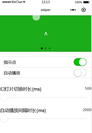
<view class=”container”>
<view class=”page-body”>
<view class=”page-section page-section-spacing swiper”>
<swiper indicator-dots=”{{indicatorDots}}”
autoplay=”{{autoplay}}” interval=”{{interval}}” duration=”{{duration}}”>
<block wx:for=”{{background}}” wx:key=”*this”>
<swiper-item>
<view class=”swiper-item {{item}}”></view>
</swiper-item>
</block>
</swiper>
</view>
<view class=”page-section” style=”margin-top: 40rpx;margin-bottom: 0;”>
<view class=”weui-cells weui-cells_after-title”>
<view class=”weui-cell weui-cell_switch”>
<view class=”weui-cell__bd”>指示点</view>
<view class=”weui-cell__ft”>
<switch checked=”{{indicatorDots}}” bindchange=”changeIndicatorDots” />
</view>
</view>
<view class=”weui-cell weui-cell_switch”>
<view class=”weui-cell__bd”>自动播放</view>
<view class=”weui-cell__ft”>
<switch checked=”{{autoplay}}” bindchange=”changeAutoplay” />
</view>
</view>
</view>
</view>
<view class=”page-section page-section-spacing”>
<view class=”page-section-title”>
<text>幻灯片切换时长(ms)</text>
<text class=”info”>{{duration}}</text>
</view>
<slider bindchange=”durationChange” value=”{{duration}}” min=”500″ max=”2000″/>
<view class=”page-section-title”>
<text>自动播放间隔时长(ms)</text>
<text class=”info”>{{interval}}</text>
</view>
<slider bindchange=”intervalChange” value=”{{interval}}” min=”2000″ max=”10000″/>
</view>
</view>
</view>
NOTICE:【咨询风格酷】客服微信:wwwxmamnet
NOTICE:【风格酷模板网②群】QQ群:288678775
☉免责声明:本站所有模板均来自用户分享和网络收集,仅供学习与参考,请勿用于商业用途,如果损害了您的权利,请联系网站客服,我们核实后会立即删除。
☉如果源码网盘地址失效!或有其他问题,请点我报错,谢谢合作!
☉人民币与积分汇率为1比10,即1元=10积分.有任何疑问请联系客服!
☉如有其他问题,请加网站客服QQ(1131734965)进行交流。
☉本站提供的源码、模板、软件工具等其他资源,都不包含技术服务,请大家谅解!
☉源码、模板等资源会随着技术、环境的升级而存在部分问题,还请慎重选择。

